Colour usage
Let the secondary palette create the space; the primary palette brings the energy.
Achieving the right colour balance is essential. Overusing MSB’s primary colours can make communications feel heavy or intense, while underusing them may result in work that feels muted or lacking presence. The key is thoughtful, intentional use; allowing warmth and clarity to coexist without competing for attention.
Colour balance guide

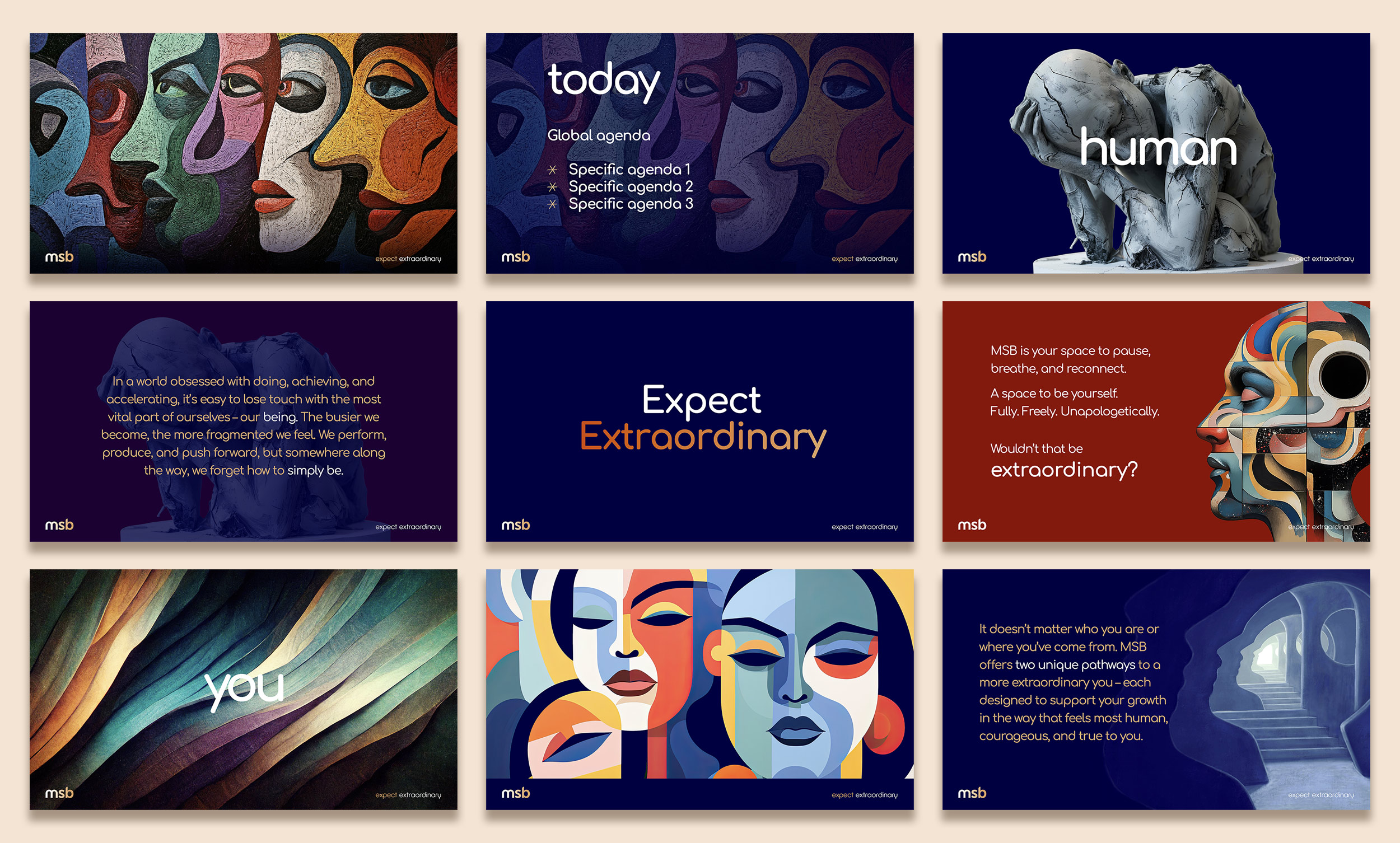
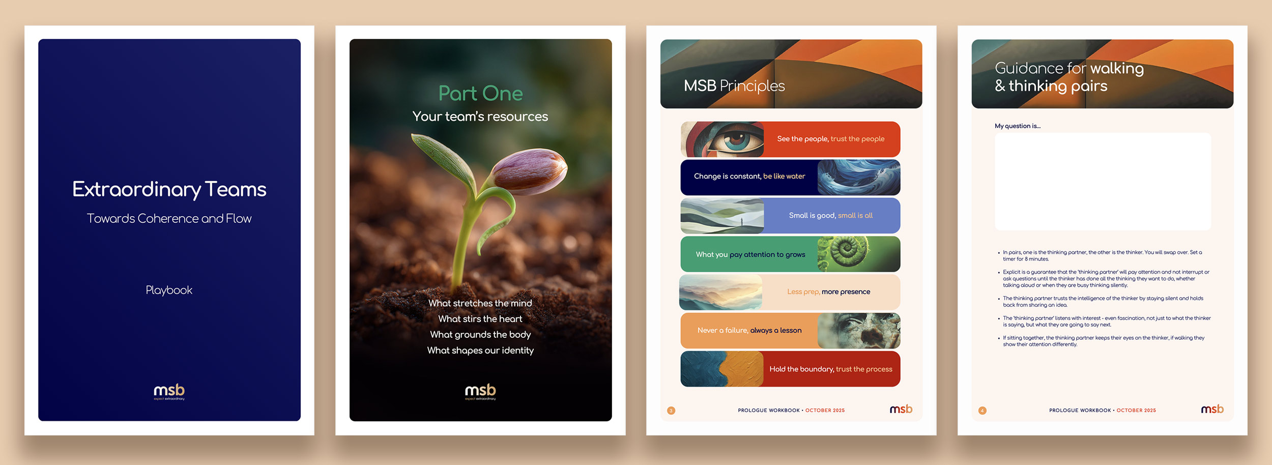
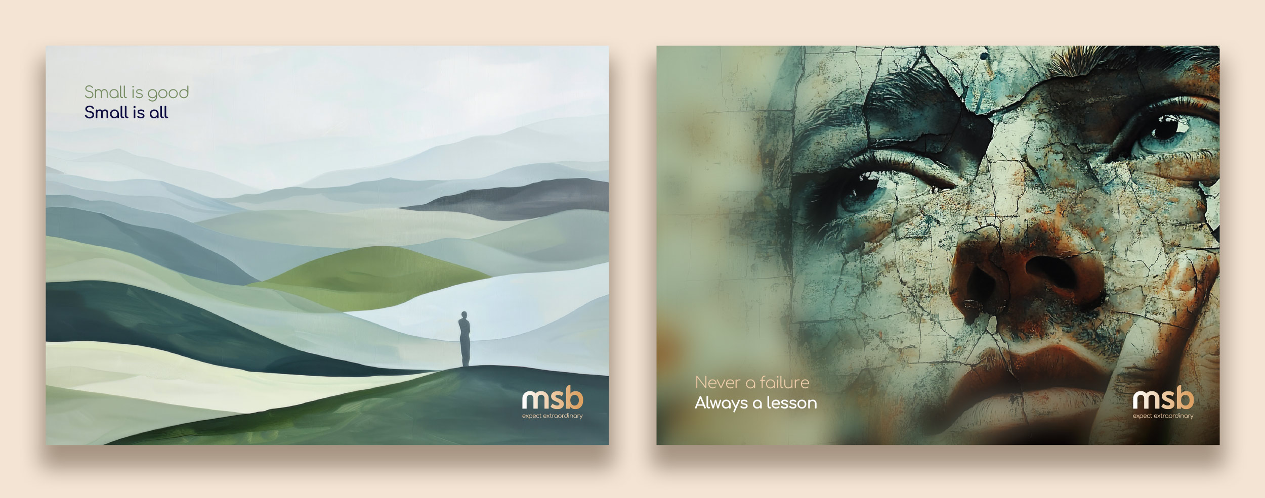
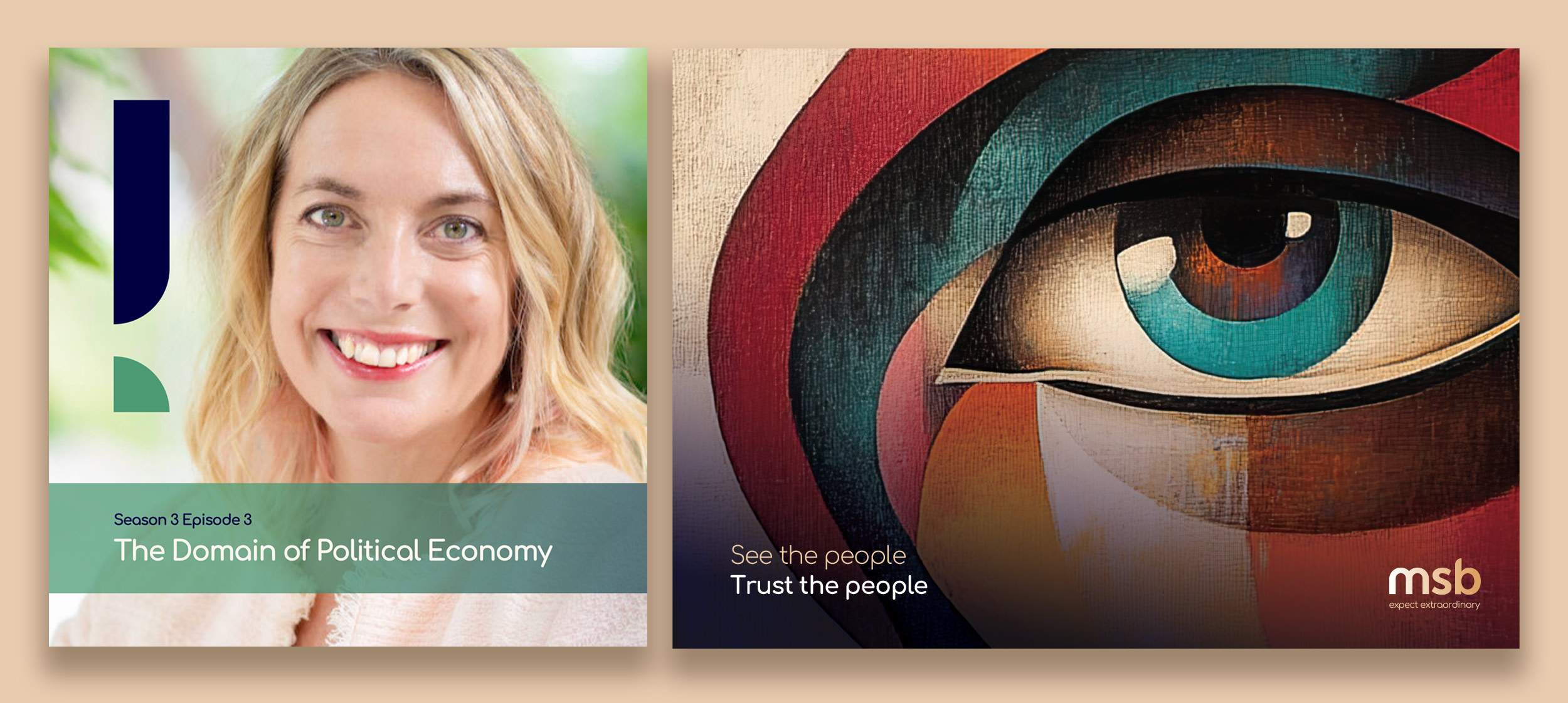
As a general rule, allow Tan and its lighter tints to form the canvas, with primary colours used as points of emphasis (as shown in disc 1). White and light secondary tones should dominate content-heavy communications, creating breathing room and supporting readability.
Alternatively, when a more dramatic effect is desired, MSB navy can be used as a background, with the other colours used in smaller proportions (as shown in disc 2).
The Humanity Gradient may also be used as a background element where it adds meaning and continuity. When used this way, it should remain soft and restrained, allowing content to sit comfortably on top without sacrificing legibility.
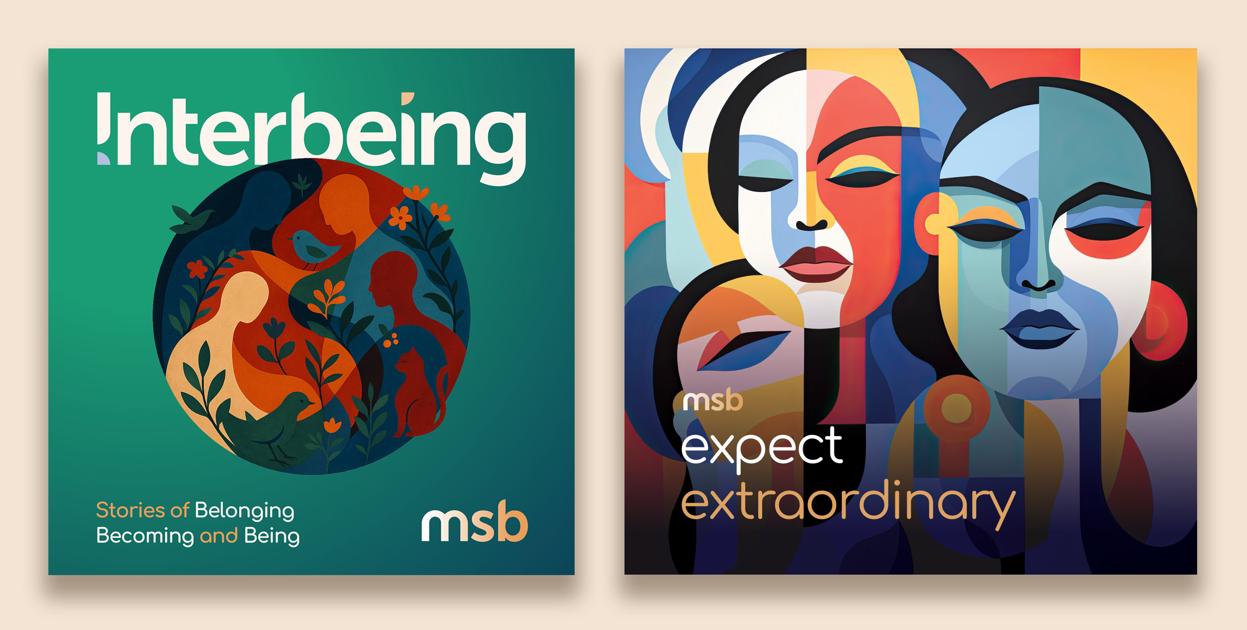
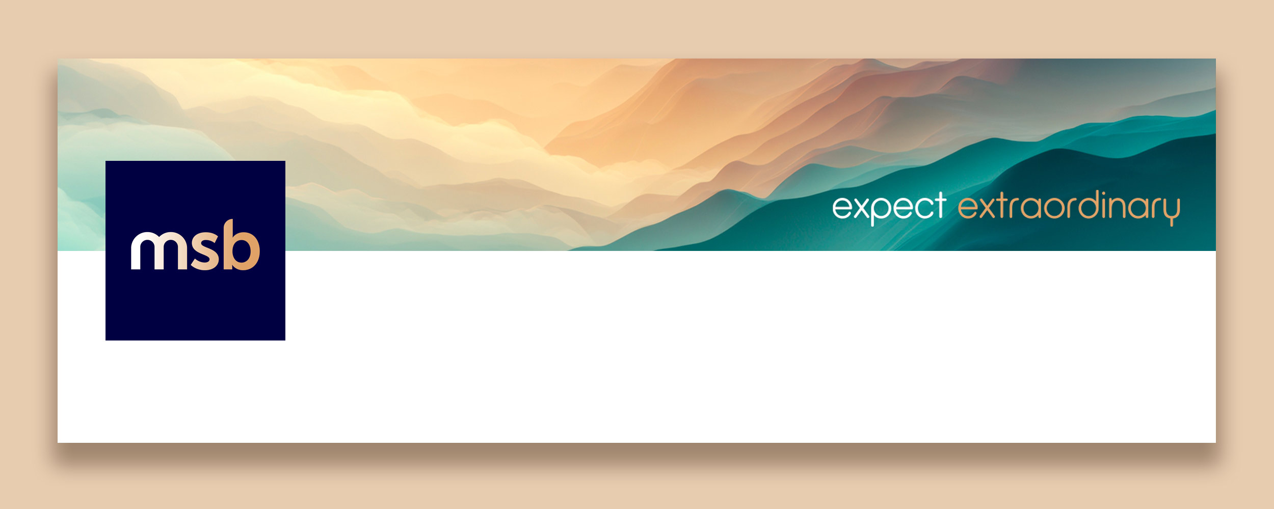
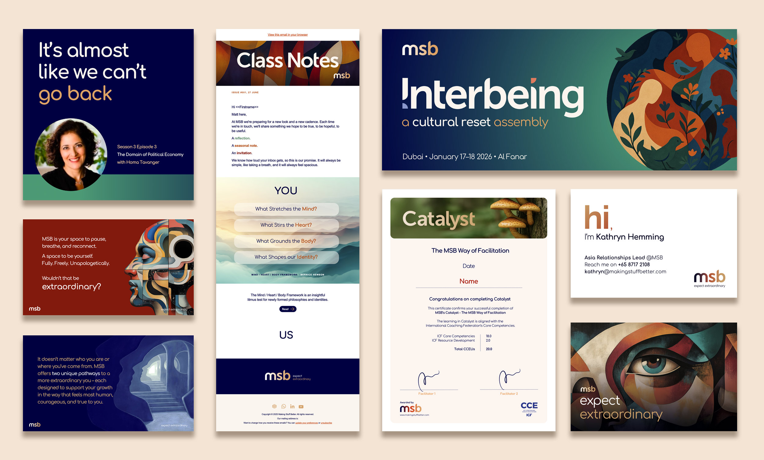
Richer use of primary colour (as shown in disc 3) is best reserved for smaller, more focused brand moments, such as banners, hero panels or short-form digital placements, where impact and recognition are required.
Balance, restraint and intention are what give the MSB brand its calm confidence.
Colour Do's and Don'ts

Use Tan and its lighter tints to create space and calm in content-heavy layouts.
Use the Humanity Gradient intentionally, where it reinforces meaning or signals transition.
Prioritise contrast and legibility, ensuring all colour combinations meet accessibility standards.

Don't use all primary colours at equal strength in the same layout.
Don't apply the Humanity Gradient decoratively or at full intensity where it distracts from content.
Don't place text over colour combinations that reduce clarity or strain the eye.